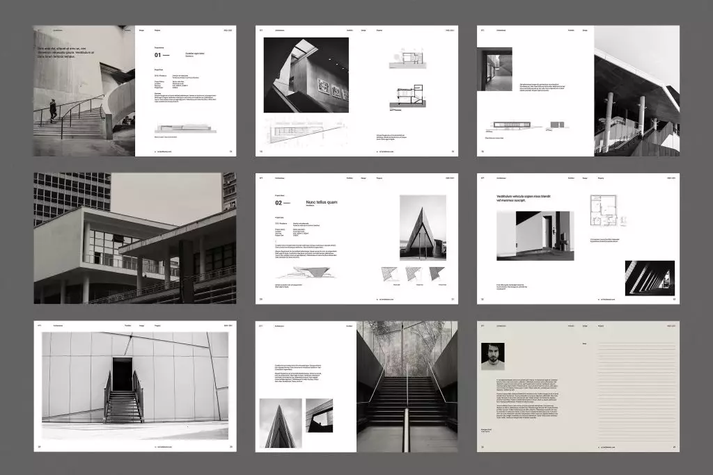
The Ultimate Guide to Architecture Portfolio Design & Layouts

Table of Contents
When it comes to designing an architecture portfolio, one should keep in mind that a portfolio is like a masterpiece. It not only showcases your designs but also your unique vision and capabilities. Whether you are a seasoned architect or a fresher, this blog is a comprehensive guide that will help you navigate through the intricacies of a portfolio in today’s dynamic landscape.
This guide aims to demystify the art of architecture portfolio creation, providing a step-by-step roadmap to align your skills and projects with the expectations of potential employers, clients, or academic institutions. From understanding the fundamental purpose of a portfolio to exploring diverse presentation mediums, each section is crafted to empower you with the knowledge needed to curate a standout portfolio that resonates with your audience.
Remember, these guidelines are flexible, adaptable, and meant to serve as an expression of your individuality, let this guide be your trusted companion, providing insights without imposing constraints. Before we dive in and sculpt your architecture portfolio, let’s understand the fundamentals of a portfolio.
Why Do You Need A Portfolio?
In a creative field like architecture, skills and knowledge are not the sole determinants to get you hired for a job or an internship. The way you present and showcase your skills backed by your work experience is what makes all the difference.
A professional portfolio does just that and more. It enables you to put forward your skills and knowledge in a more organised and structured manner which finally helps to attract the likes of clients and employers.
What are the Must-Haves for an Exceptional Portfolio?
An architecture portfolio is a very thoughtful document that gets prospective employers up to speed with your work experience. That said, the content of your portfolio is entirely proportional to your position in the hierarchical structure of an architectural firm.
Read more: Creative Jobs for Architects That Are Shaping the Future of the AECO Industry
1. Students/Interns
A portfolio is a must-have document for interns and students as it shadows the way you think, ideate, and perceive the world. It helps to set you apart from the herd in the eyes of prospective universities and employers
2. Junior Position (1-3 years experience)
In the initial stages of your career, your portfolio is a blend of your academic excellence and professional expertise. The idea is simply to get prospects familiar with your developed design sensibilities and how they can match the new office style.
3. Mid-Level Position (3-10 years experience)
Having a good understanding of the industry and its work processes, at this level, the portfolio intends to state what you can bring to the table. It is advised to detail down on your niche and design sensibility, and highlight your best projects and award-winning projects.
4. Senior Position (> 10 years experience)
At this stage, you have accumulated vast and versatile experience, and your portfolio should explicitly reflect that. Display your expertise in managing end-to-end projects from the pre-design stage to the construction phases.
5. Collaborative Projects
As we know this industry demands the involvement of multiple stakeholders, and your efficiency in working in teams must be reflected in your portfolio. How do you achieve it? Simply name a particular project give credit to other stakeholders, and elaborate on your contribution as a valuable factor for successful completion of the project. Big firms and companies highly appreciate individuals who communicate effectively, work flexibly, and efficiently contribute to assigned roles in a team.
Now let’s have a look at the essential elements of an architecture portfolio.
What is Layout Design?
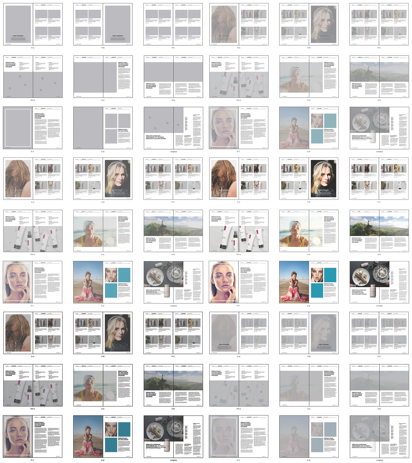
Layout design is the process of arranging visual and textual elements on-screen or on paper to grab a reader’s attention and communicate information in a visually appealing way. Layout design is important for any project that conveys a message through eye-catching visuals, such as magazine layouts, website designs, and portfolio layouts.
Architecture firms have increasingly begun focussing on the layout design of the applicant’s portfolio for the job selection process. This is because a good layout indicates more than just an understanding of visual design. A good layout shows that the applicant can communicate clearly and effectively, is aware of the various design principles, gives attention to detail, and loads more about their personality.
Some key pointers that you should not miss out on include:
-
Make sure it is easy to understand: A good portfolio layout design can help achieve a smooth message flow to maximise performance. Looking aesthetically pleasing is not enough, your design must be user-friendly and versatile.
-
Highlight your strengths: You might have 5 strengths but 2 on the top are the match for the position you are looking for. These 2 could shine throughout your architecture portfolio.
-
Detailed, step-by-step process: The process is as important as the final product, so show the process steps. Your design process defines you as a designer and shows that you pay attention to detail. Be proud to show it!
-
Don’t clutter one slide with everything that you want to say. Focus on one thing at a time.
-
Strong Conclusion: Make it clear why you are fit for the job as the ending will leave a strong impression after they finish reviewing your portfolio.
For more portfolio tips, check out: 12 Architecture Portfolio Tips to Make Your Application Stand Out

Elements of Layout Design
The elements of design refer to the basic building blocks of any composition. There are a variety of graphic design elements to consider when creating any architecture portfolio or visual work of art, such as colour, image, line, text, space, and balance.
1. Colour
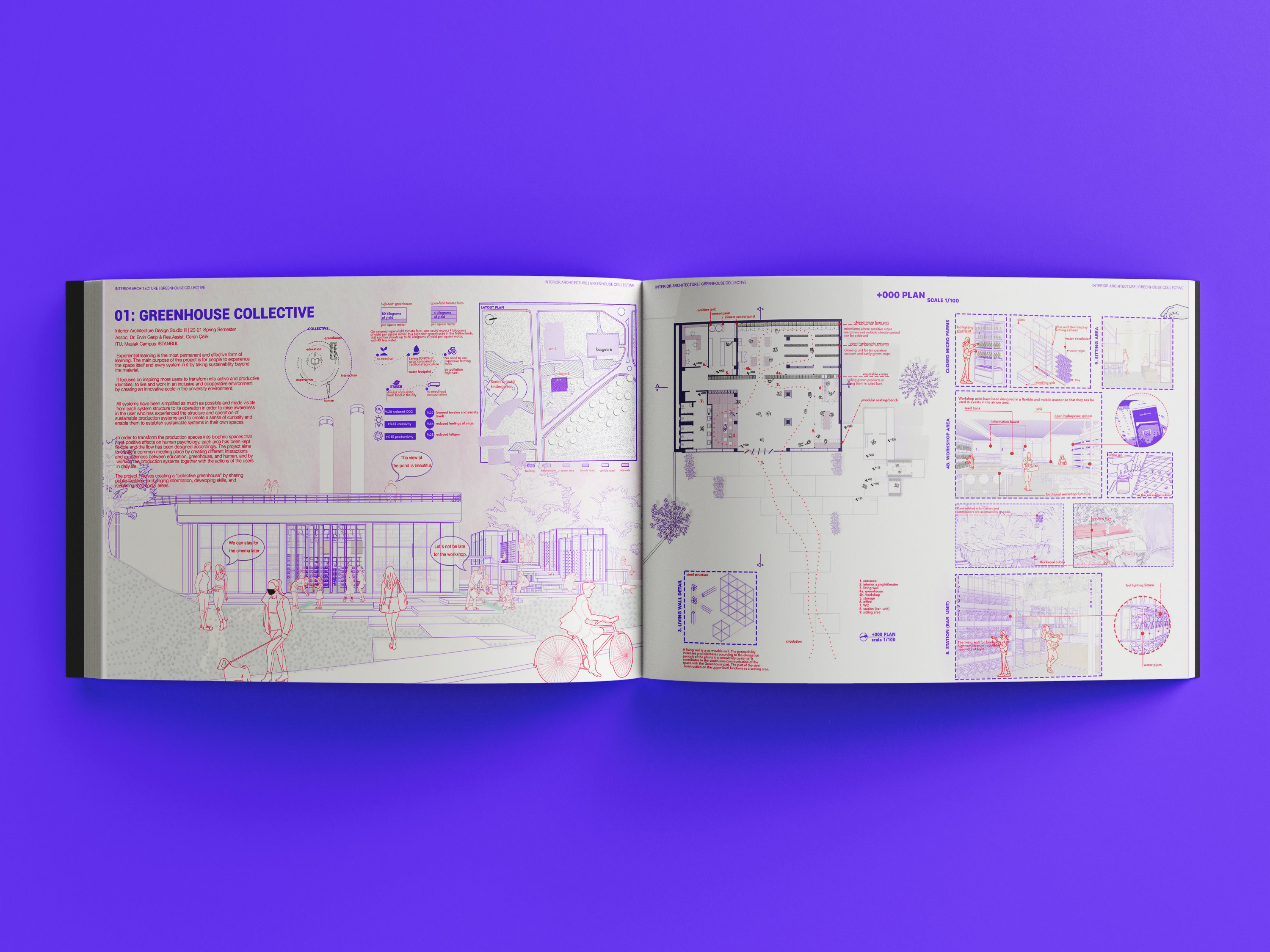
Colour helps establish a mood for your composition. Architects use the colour wheel and the tenets of colour theory - a set of guidelines for mixing, combining, and manipulating colours - to create colour schemes.
You could let your colour choice serve as a visual identity for your architecture portfolio. To instil a strong identity, you could either go for a perfect minimalist colour palette (some people even prefer a greyscale portfolio) or choose full-bleed architectural renders covering your entire spread.
2. Image
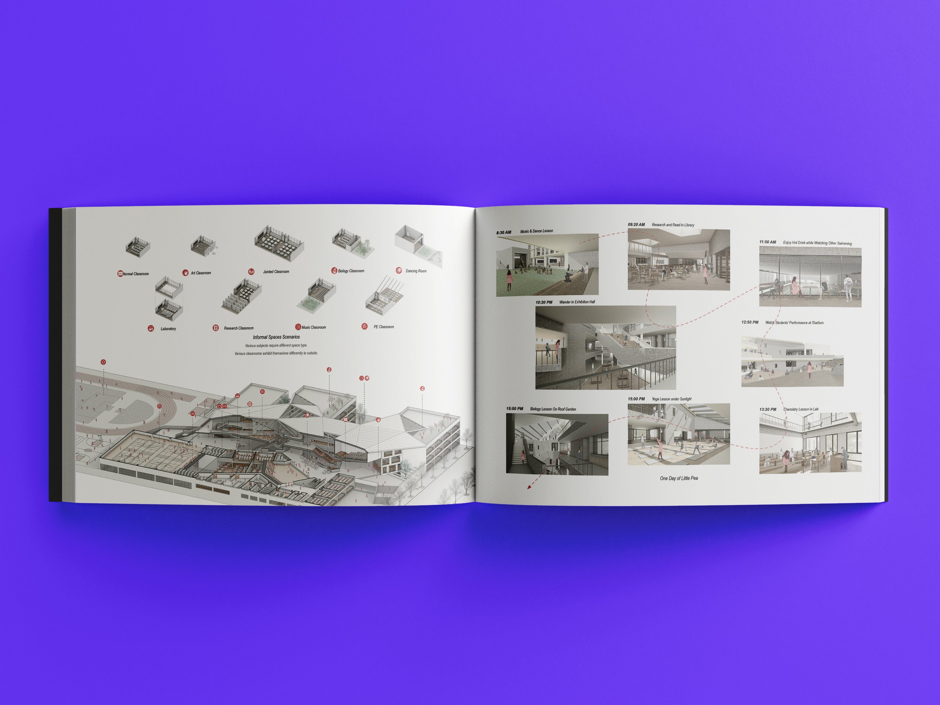
Images in your graphic design can include photographs, illustrations, and infographics that become a part of your layout. Large images can grab the attention of your audience and communicate messages without the need for text. You can even go for a range of images and create a spread out of it. This helps clearly state your design intent and process.
Instead of arranging the images in a formal fashion, you could go for unique representation ideas such as flowcharts, concept diagrams, and site study diagrams.
3. Line
Lines help direct the user’s eye toward a certain point in your composition. They can also draw boundaries between sections or visual elements of your layout.
For your architecture portfolio, you could use lines to divide the sections for a clear and effective composition. A neat layout not only helps convey the information better but also says a lot about your personality!
Read more: Masters Vs Cohort-Based Learning: Which is Better for Architects and Engineers?
4. Text
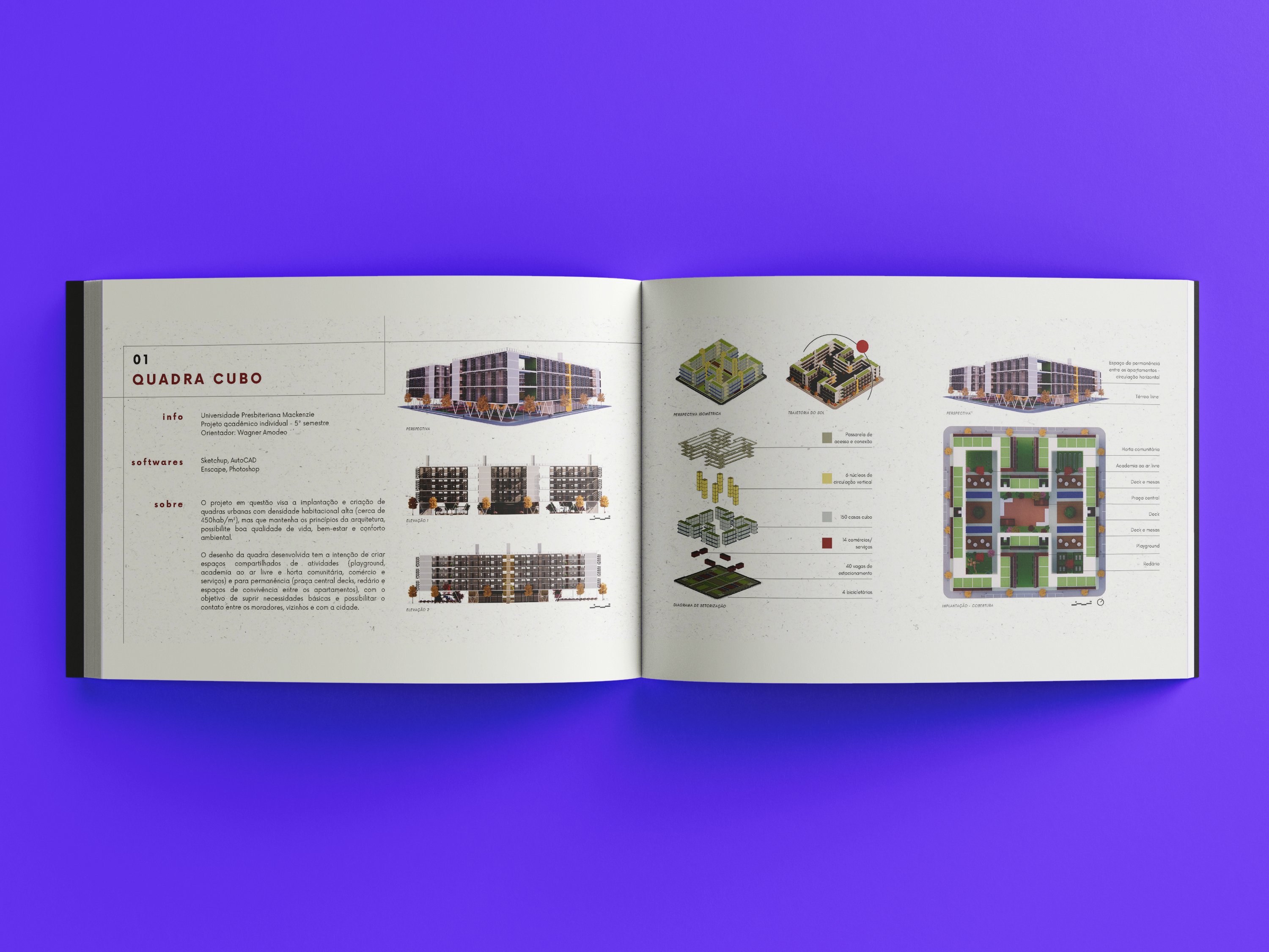
Text in layout design includes headlines, subheadings, headers, footers, and paragraphs. When choosing the perfect typeface (or combination of typefaces) for your portfolio, it is important for it to be clear, legible, and readable. Here are some tips that can help you with this:
-
Avoid using fancy fonts or uppercase text in large bodies of text as it forces strain on the reader’s eye.
-
Limit the number of fonts. Avoid using more than 2–3 fonts in your architecture portfolio layout. Each time when you think you need a new font, you can play with different font sizes and styles of existing fonts.
-
Serif v/s Sans - this is a dilemma that every designer faces. One of the most important points to make this decision is the length of your copy. Generally, serif typefaces are easier to read for lengthy copy than sans. Sans, on the other hand, is preferable for young children and readers with certain visual impairments.
-
It’s beneficial to choose a typeface that works well in multiple sizes and weights to maintain readability in every size. Some fonts are members of ‘superfamilies’ — they come along with a selection of different styles and weights that give designers more creative freedom.
5. Space
Making proper use of space can help others view your design as you intend to. The blank space or negative space between elements in layout design is as important as the visual elements themselves. The spacing around an element can draw attention to it and make it stand out.
6. Balance
Most of the things that are appealing to the human eye contain a sort of balance. A balanced layout requires symmetry, asymmetry, or radial symmetry. Symmetrical and asymmetrical balance is the easiest to achieve and is also the most common. Meanwhile, radial symmetry is vital in prints, but also really hard to create on a website.
Novatr Tip: Creating a stand-out portfolio is like working on a project: begin with a "brief" for yourself, and then proceed to plan, research, decide, outline, and deliver your goals in the form of high-quality outcomes.
Common Portfolio Layouts
For those new to the idea of portfolio creation, it can be difficult to absorb that they are not designing individual pages, but "spreads". A spread is a full layout design where you can view two pages at the same time. Ideally, a single project shouldn't go beyond 2 spreads, but if required it can go up to a maximum of 4 spreads.
Some of the common layouts are:
1. Grid Layout
The layout composition is easy to make if it is based on a grid. A grid helps divide and use the given space in an organised manner. A grid is made after the centre of interest is decided, depending on the requirement. The process goes as follows:
- The process first involves dividing the page into vertical and horizontal sections of equal size.
- Then, margins are added around each unit. The margins indicate breaks between columns of copy and or breaks which would keep blocks of elements from coming too close to each other.
- The divisions can now be used as required to place text or visual images.
It can also incorporate the "rule of thirds"- a well-known composition rule used in visual mediums. Dividing the page into three parts or a nine-square grid, allows your layout to run up against these guides or pass by them to create visually appealing frames with optimal layering.
2. Mondrian Layout
Mondrian layout typically uses horizontal and vertical black bars to divide the entire page into rectangular shapes. The shapes can be filled with colour, images, text, or a combination of those elements. You can use a similar layout for the cover page of your portfolio, as it is generally not recommended to include a lot of colours for the main content.
3. Circus Layout
With the irregular arrangement of elements that evoke creativity and great impression, the circus layout is best for process steps, research studies, and case studies.
Break the rules!
The last and most important tip would be to simply break the rules. At the end of the day, a portfolio is a visual representation of your identity, your thoughts, and your creative expression. Pablo Picasso once said, “Learn the rules like a pro, so you can break them like an artist.” I think this very well applies to the field of architecture as well.
Make a good portfolio layout and be sure to secure a high-paying job and a successful architecture career.
I hope this blog gave you the insight you needed to accelerate your career in the Architecture, Engineering, and Construction (AEC) Industry by getting the portfolio done right.
Novatr offers courses on the two most in-demand skills in the AEC industry– BIM Professional Course for Architects V2.0 taught by industry experts with years of real-world experience working in the industry. You will also get to work on real-life projects, which will undoubtedly be good additions to your architecture portfolio.
Go to our Resources page if you want to get more insights on AEC careers, software & tools, and industry trends.

 Thanks for connecting!

.png)
